User Opinions
|
||||||||||
|
|
|
| Wed Dec 6, 2006 - 11:08 AM EST - By Xious Sonenberg | |
|
|
|
|
|||||||||||
Naturally, to keep up with the times, mOcean 3 has been "modernized" with slick gel-looking shadowing and a cleaner font. Unfortunately, (or fortunately depending on your personal esoteric tastes) it seems that "Chicago" is gone, replaced with something more along the lines of "Charcoal" to freshen up the appearance of the interface. You could always switch it back by downloading (or making) a skin with the old "Chicago" font, but unless you�re really feeling peeved over the change it isn�t really necessary; the new font looks nice anyway.
The menu layout is also better, and is now customizable using the "Settings -> Main Menu" option, so you can move things around to more comfortable locations or bring commonly used options to the front.
This couldn�t be easier either, as the method for doing so is very straightforward, using a system of �On/Off� boxes to select what appears in the main menu tree. So, if it tickles your fancy you can move your preferred EQ settings right to the front, including such improvements as the new Graphic Equalizer.
That�s right, the old hard-set EQ settings are still there, but MA have decided to add a graphic EQ to the list of options, albeit only a 4-band one. I hope that this will change soon, as anyone knows that you need at least 5 bands (2 low frequency, 2 high and one mid-range) to properly tune a song for ideal listening, with 10 being far superior.
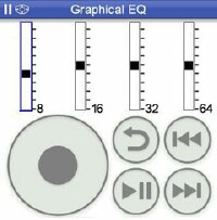
This new EQ does work in strange ways though, as you can�t use the stylus directly to set it. To adjust, you use the wheel as with everything else in the program, and it takes some getting used to I�ll tell you. It�s kind of like using a Parametric Equalizer with a graphic display, unless you switch out of wheel mode entirely, and then it works as would be expected, using the stylus to adjust the EQ sliders.
mOcean also has a pre-amp now, situated under �Audio Output -> Volume Boost� as a sub-tree in almost every menu option. This is good, as if you�re listening to a track on headphones, rather than on your car stereo you�ll need it. It would be nice to have it creep into the graphic EQ too, as its own slider, much as in other players of this sort.
In any event, it�s an improvement over the last two-and-a-half versions, and shows off the excellent growth of this product, which is still less than a year old and already in its third incarnation; not to mention that Apple�s newest iPod still has no graphic EQ at all, which puts mOcean a tier above the product it mimics.
Of course, mOcean supports more than just the basic sound and motion we�ve outlined. The new slick interface has options for Photos, which includes anything you capture with your built-in tiny-cam, as well as anything else you cram into the DCIM directory on your SD card.
You browse photos using the wheel; opting for whichever category, you plan to view. You make these photo sets by creating new categories within the Camera app, or generate them with the directory names (under DCIM) on your card. The mO photo browser starts in slideshow mode, but you can set it to static mode by tapping the center button on your Treo�s 5-way pad. Tap back, or press your 5-way to the left to go back to the thumbnail listing. You must put your files on an SD card to play them, as mOcean does not support playing files in your Treo�s internal memory.
If you�d like a snazzier backdrop for mOcean, you can snag one from your photo albums by selecting any image from the Photos section. Once you have the desired image up, press the menu key on your keyboard to set it as your default background image in mO. You can even alter the brightness levels of the image from within the �Photo-> Background� settings menu, easily modding the picture until you can clearly see the controls.
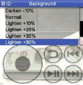
You�ll also see a "skins" option to select different styles of image viewing, customizable to your refined tastes. The default is "White", and a variety of additional options are bundled with the installation. "Organic" has more of a "Windows Blue" feeling to it, and you can tweak the settings of each skin to fit your desires as well, including setting the font colors for each part of the application.
Also in this new version is a Podcast mode, under which you can either select from a list of recommended Podcasts, or jump right into one anywhere online, such as the weekly Treocentral podcasts by selecting the "new Podcast" option and entering a URL into the requester box. You can select to auto-update your favorite �casts by one, two, three, five, ten, fifteen or thirty day intervals, and select which hour on each day you want to poll for a new one.

Internet radio stations also make their first appearance in mO3, with the same recommended option, and user definable URL screens and preferences settings as the Podcast mode. Not to mention that with the improved Sync utilities (including a totally revamped mOceanSync for MacOS X), merging your iTunes preferences for Podcasts or Internet Radio stations is a snap. Very nice.
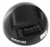
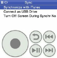
Playlist creation for MP3 files still works the same way as it has in all previous versions, but alas you still can�t delete a file off your SD card from within mO3. If you feel the need to do so, you�ll have to exit mO first, and bring up FileZ (or mount your card on your PC) to eradicate the unwanted file. Oh, and mounting your SD card is quick and pain free too, as mO3 includes the ability to do so using your docking cable or favorite cradle, such as the Seidio INNODock, just like mVoice does, eliminating the need for carrying around a bulky card reader and its assorted arrangement of cables. Just choose "Connect as USB device" from the Sync menu and you�re good as gold.
These days, album art is important to a lot of people, and it isn�t overlooked either. Any album art you have stored in iTunes is transferred to your Treo with the Sync utility, so if perchance you want to view the cover to your latest "Metallica" album, you can. This works much like an iPod: The artwork is displayed in the player next to the track name, and you can blow it up by selecting the album art view, which is just after the jog view, which allows you to fast forward or rewind to a specific position in a file. You access these "alternate views" by tapping the center button on the wheel, or on your 5-way pad several times when playing a file.
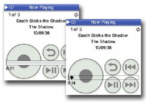
The only other player for PalmOS that does this is the rather unstable Busker, and it�s tremendously refreshing to now have so many choices in music players for the PalmOS.
You can also sort music by genre, which mO understands by using the ID3 tags embedded in each MP3 file, or bookmark your position in your favorite tunes or videos with the "menu item name" option. This feature works amazingly for audio books, or for Podcasts, allowing you to pause listening and then resume right where you left off.
If you�re like me, you�ll also appreciate the programs inherent inclusion of Audio Book playback, supporting a much wider array of bit rates then previous versions. Like the other new features, you�ll find an Audiobooks menu right off the main tree, with "recommended Audiobooks" right underneath it.
Copyright 1999-2016 TreoCentral. All rights reserved :
Terms of Use : Privacy Policy
TREO and TreoCentral are trademarks or registered trademarks of palm, Inc. in the United States and other countries;
the TreoCentral mark and domain name are used under license from palm, Inc.
The views expressed on this website are solely those of the proprietor, or
contributors to the site, and do not necessarily reflect the views of palm, Inc.
Read Merciful by Casey Adolfsson