|
|
|
| Wed Jan 7, 2009 - 4:33 PM EST - By Jennifer Chappell | |
|
|
|
So the Smartphone Round Robin has wound down, and I'm back home with my Treo Pro. I recently posted my video review and also announced that we've extended the Round Robin until January 10th due to some of us not finishing everything in the allotted time. But of course that just gives all of you more time to get more entries in for a chance to win a Palm Treo Pro.
It was hard not being able to use my Treo Pro or Centro all those weeks of the Round Robin. I always had them nearby and even took some comparison shots of both devices for my Round Robin articles. I had a few work-related texts sent to my Centro, but other than that, I never used the Centro or the Treo Pro during the Round Robin.
For this final Treo Pro article, I'm going to do as fellow editor Rene did and focus on comparing my Treo Pro to the other Round Robin smartphones.

I enjoyed using the Fuze in the Round Robin. The Fuze is a gorgeous smartphone with lots of bells and whistles. Some of the graphics on the Fuze blew me away. I actually wouldn't mind owning a Fuze myself someday.
The Treo Pro and the Fuze are both nice looking smartphones done in glossy black. And they're both fingerprint magnets. I think the Fuze is the worst of the two though. The Treo Pro and the Fuze were built by HTC and run Windows Mobile. I find the Treo Pro to look a bit sleeker because it doesn't have the slide out QWERTY keyboard. Instead it has the front facing QWERTY that is right there, at the ready for all your texting and emails. Another plus for the Treo Pro's front facing keyboard is that you can use it one-handed.
But I do like sliders, and even though I needed to take the extra step to slide out the keyboard on the Fuze, typing on the keyboard was easy and fun. Besides looking great, the Fuze keyboard has lots of features on it. There are dedicated shortcut keys for Email, Internet, Contacts, and Calendar. And there are Fn shortcuts for IM, SMS, AT&T's Music Directory, AT&T's Video Service, the Wireless Manager, and switching between T9 and ABC modes. Plus there is a dedicated key for the Windows Mobile Start menu and an OK key. There are also indicator lights for Caps and Fn. With all those cool features, I really couldn't care less that there isn't a dedicated row for numbers.
The beautiful screen on the Fuze with its TouchFLO 3D was very impressive. I enjoyed going through the apps on the Fuze more than I do on the Treo Pro and the graphics on the Fuze were great. However, I did have some problems with lag at times when trying to get some apps to open. Plus the screen rotation lagged whenever I would slide out the keyboard.
The Treo Pro is quite snappy and I haven't found mine to lag as of yet. I appreciate the task manager in the upper right of the screen that shows which apps are currently running. It also lets you close them out.
The Treo Pro ships with Internet Explorer, which is okay, but surfing the Web on Opera Mobile on the Fuze was a better experience. I've put SkyFire on my Treo Pro since I've started using the Pro again and find that browser to be very good.

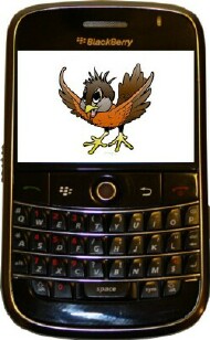
I find the Treo Pro and the BlackBerry Bold to be equal in looks. They're both sleek and sexy. The Bold is a bit wider though so I prefer the Treo Pro. I love the front facing keyboards on both smartphones. They're both fun to type on and are great for typing out long emails.
I love the trackball on the Bold and sometimes wish that the Treo Pro had a trackball too. The trackball is so fast and smooth and can zip around the apps very quickly. But when you're scrolling down a long page, the Treo Pro wins out because you can hold down on the "down" portion of the 5-way button and automatically continue scrolling downwards.
The user interface on the Bold seems sort of cluttered and confusing at times. I spent lots of time searching for the right folder. But then again, I'm not all that crazy about WM and I find myself doing some searching there as well. I still just plain out prefer the Palm OS for its simplicity.
I really liked the Bold's back cover, which was a faux leather. Because of the grainy texture on the cover, the Bold is easier to hold and you get a good grip on the phone. The back cover was very simple to remove, unlike the back cover of the Treo Pro when I first got it. Now that I've taken the Treo Pro's back cover off several times, it's not as hard to remove anymore.
Many people talk about how the Bold is ready to use right out of the box. I think that's true for the Treo Pro as well. For me anyway since I'm not a power user. Both smartphones could certainly use some tweaking here and there, and there are many apps out there to be downloaded for that purpose.
The Bold is great at crunching email and letting you know that you have waiting email. The bright red LED lets you know that you have waiting emails. The Treo Pro has Enterprise mail as well but I don't use Enterprise mail. Anyway, the Treo Pro can also let you know that you have unread email. Only it does it in a more subtle way, with the cool screen saver that floats around on the screen. The time and date are always right there on the screen of the Treo Pro, and if you have any unread email, there's a graphic of an email also. You never have to activate the Home screen in order to see the time, date, or email notifications because it's right there on the screen saver.
And it probably goes without saying that I prefer a touchscreen on a smartphone, but I'd still be proud to own a Bold anyday!

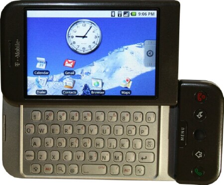
I find the G1 to be an odd looking device on the outside because of the chin. Once turned on though, the G1 is looking mighty good. I love the user interface on the G1. Everything is simple and layed out for you, so there's no searching around in hard to find menus or folders. The big 320 x 480 capacitive touchscreen looks great. There are nice big icons on the Home screen, plus a big clock. I love the menu tab that you can pull out to reveal all the applications. You just swipe it with your finger or touch the tab with your finger and hold it to open the apps.
Below the screen is the Menu button, Send, Home, Back, and End/Power buttons, and a nice trackball. Most of these buttons are flush except for the trackball and Menu button. All the buttons on the front of the device can awake the G1 except for the trackball. When the device comes on, the screen is locked, and you have to press the Menu button to unlock it. The End button hangs up calls and also locks the device. And I just found out recently that the End button also wakes up the screen.
I like having all those buttons on the front of the G1. Except for the trackball, the buttons on the front were very Treo Pro-like, so somewhat familiar. I appreciate the flush buttons on the Treo Pro that surround the Center button. And like with the G1, most of the buttons on the front of the device wake up the screen. I really appreciate that feature.
Being the Google phone, the G1 is very Google oriented. You're asked to log in to your Google account when you first turn on the device. Your email, contacts, and calendar all are synced with your Gmail. Although I found this very simple, I had way too many contacts synced because it syncs all your contacts in Gmail. But all in all, the syncing was made so easy and I didn't have to worry about downloading some software to help me sync.
Getting 3rd party apps for the G1 is interesting. Under applications, is a Market, from which you have a choice of Applications like Communication, Entertainment, Finance, News & Weather, etc. And you can download Games. All the apps are Free and very easy to download. I downloaded ShopSavvy, an app which uses the G1's camera to scan barcodes and give you the price of the item. That was so cool!
I like slide-out keyboards and the G1's keyboard is pretty cool and it slides out in a unique way; out and upwards instead of just upwards. But I did have a problem reading the letters and numbers on the keys. So I definitely prefer my Treo Pro's keyboard to the G1's. All the keys are easily readable on the Treo Pro and the keyboard is easy to type on. Plus I can use the Treo Pro's keyboard one-handed.
Even if I could have read the letters and numbers clearly on the G1, the keyboard itself was a little awkward since the chin on the right side made the keyboard seem off center. But I love the layout of the keyboard and appreciate the dedicated number row at the top. There's lots of space between the keys too, which is nice. Plus there is nice tactile feedback when typing.
Overall, the G1 was a very fun smartphone to use. I really give that user interface props. Using the G1 made me look even more forward to Palm's upcoming platform since it will have the Linux kernel.

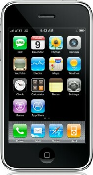
I own both the Treo Pro and the iPhone 3G and love them both. Both smartphones are very sleek looking. And of course they both look very different from one another too. The iPhone's front is mostly the huge screen and has the lone Home button at the bottom.
The Treo Pro doesn't sport that huge screen but it does have a built-in, front facing QWERTY keyboard. The iPhone has the virtual keyboard which is pretty neat, but I still have problems typing on the keyboard. It's so much easier for me to type on the Treo Pro's keyboard because I can use both thumbs and type quickly. I've tried to type that way on the iPhone but just can't do it. I know that many people can though. My thumbs just feel too big and I make less typos when I use my index finger.
I have to admit that I prefer the iPhone 3G's user interface over the Treo Pro's. The iPhone is more fun to use. I love the multi-touch technology of the iPhone too. And goodness knows that I much prefer the iPhone's browser over Internet Explorer on the Treo Pro. Safari is just the best browswer out there right now in my opinion. But it's good to know that we can download SkyFire and Opera on our Treo Pro's and get a better browsing experience than Internet Explorer.
As far as the phone function goes, I would call it a tie between the Treo Pro and the iPhone regarding reception. However, I do find it easier to initiate phone calls on the Treo Pro than on the iPhone. With the iPhone, you have to take more steps to get to the phone calling process. I did find a nice app to take care of that problem though. In the Round Robin, I downloaded Smart Dial to make it easier to call people. Now instead of having to go to my Contacts and scrolling endlessly, I can simply type in a few letters and the number of the contact I want to call pops up at the top of the screen, and all I have to do is press "Call".
Although I love my iPhone 3G, I still have some gripes with it. Besides not having a user replacable battery, the iPhone lacks voice dialing, cut and paste, A2DP, slot for expandable memory, and video camera function. If I were a power user, I'd be more upset than I am over the lack of these things. Since I mainly use my iPhone as an entertainment gadget, I won't holler too loud. I'd really love to see a user replacable battery in the next generation though. I find it so easy to swap out batteries on my Palm smartphones. But I guess either way, you're going to have to carry around a charging cord or a spare battery with any smartphone.
Being the gadget freak that I am, I can't help but love all the smartphones that we used in the Round Robin. I actually wish that I could have all of them. I had a lot of fun getting to try out all those different smartphones.
Overall, I think that the Treo Pro holds up pretty darn well next to all of them. The Treo Pro is the best looking Treo from Palm so far. I love the beautiful, flush touchscreen. I know it was late in the game for getting Wi-Fi, but I'm just glad that it finally does. The Wi-Fi works great and I depend on it when surfing the Internet since I don't have 3G yet.
I think that the Treo Pro looks just as good and even better than some of this year's Round Robin phones. The Treo Pro is thin, beautiful and very pocketable. You can easily use the Treo Pro one-handed. It's got a nice camera with video function. There are lots of keyboard shortcuts to help get you around quickly. The keyboard is great and the perfect size for my small hands.
There's Enterprise email, A2DP for stereo Bluetooth headphones, cut and paste, a user repacable battery, a micro-SD card slot, a crap load of third party apps to download. Plus the Treo Pro is very very customizable and you can tweak it to your heart's content.
No, I'm not in love with Windows Mobile, but I do love my Treo Pro. I think the more I use it, the better I like it. I do use my Centro more, but I'm glad that I got the Treo Pro because it's a great smartphone.
You've got until the 10th of January to enter the Smartphone Round Robin, so check out all the updates and head over to all the forum threads and chime in.
Thanks to all our sponsors, Celio Corp, Palm, Case-Mate, and the Smartphone Outlet!!!!
For this article, get your entries in here.
Copyright 1999-2016 TreoCentral. All rights reserved :
Terms of Use : Privacy Policy
TREO and TreoCentral are trademarks or registered trademarks of palm, Inc. in the United States and other countries;
the TreoCentral mark and domain name are used under license from palm, Inc.
The views expressed on this website are solely those of the proprietor, or
contributors to the site, and do not necessarily reflect the views of palm, Inc.
Read Merciful by Casey Adolfsson