User Opinions
|
||||||||||
|
|
|
| Mon Mar 2, 2009 - 9:39 AM EST - By Andre Kibbe | |
|
|
|
|
|||||||||||
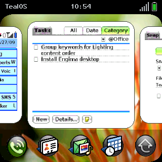
Many of us Palm fanboys lusting after the upcoming Pre are asking, "When can I get one?" I think a more ambitious question is: How can we get one now?
Fortunately for visionaries like Vince Lee and his team of ace developers at TealPoint, that question isn't considered far-fetched in the least. A few days after seeing Palm's webOS debut at CES (yes, after, not before), the TealPoint devs rolled up their sleeves and set out to recreate the webOS experience on the well-aged Palm OS.
The result, TealOS, emulates much of the basic eye candy and user interaction found on the Palm Pre: swipe gestures, card representations of multiple applications, updated icons, and a "wave launcher" callable from within almost any application. But while TealOS mimicks the Pre, there's no true multitasking, no Synergy, no universal search, and of course, none of that lovely hardware we're all dying to get our hands on. Is TealOS enough to tide you over until the Pre hits the street? Let's find out.
TealOS has three main user interface elements: the Home Screen, the Applications Screen and the Wave Launcher.
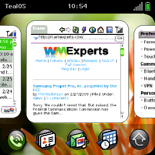
Home Screen is strikingly different than the default found on Palm OS Treos. Instead of a Phone app (which is still the default after ending a call; TealOS can't be set as the default), we see "card" representations of three apps - one in the foreground, and the edges of two others on either side. You can scroll horizontally between these apps - and as many other apps as you have open - by either swiping them left or right with your finger or stylus, or by using the D-pad. I much prefer navigating with the D-pad, and I expect to miss it when or if the Pre becomes my main device.
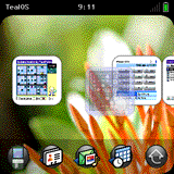
Pressing the down direction on the D-pad, or swiping down on a card, shrinks the thumbnails into "Ordering Mode" and allows you to rearrange them. Pressing the up direction on the D-pad, or tapping on the miniaturized cards, restores them to normal size. Tapping on a regular sized center card, or pressing the center button, will launch the application for that card. Swiping the card upward "tosses" the card out of the stack, but it doesn't close the application, since it's not currently open to begin with (as it would be on webOS, where the multitasking is real rather than simulated). The resizing and scrolling of cards are fairly sluggish compared to what we've seen in demonstrations of the real webOS, but there's probably only so much that can be done with Garnet.
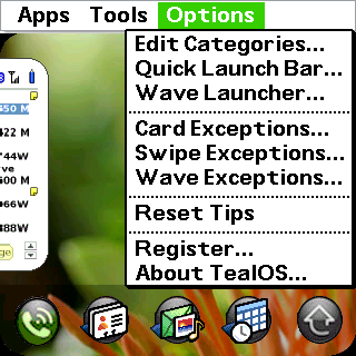
Each card is a thumbnail of an application that was recently opened. Since some applications are opened automatically, they're not necessarily wanted in the Card View. For instance, I have PalmRevolt set to launch immediately after a reset so that the UI is skinned automatically. But I don't need to see this as a persistent card. I can toss it, but I can also assign it to Card Exceptions from the Options menu, after which it won't show up in the stack.
Below the Card View row is the Quick Launch bar. The rightmost button is reserved for evoking the Applications Screen, but the other four buttons are customizable (the applications themselves, not the icon images). The ability to customize these is especially useful for avoiding redundancy with your hardware buttons.
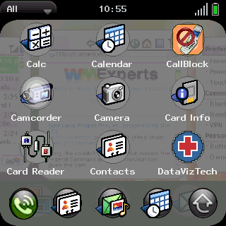
The Applications Screen is similar to the Palm OS' standard launcher, but sports a translucent gray background over a faded Home Screen. Unfortunately the Quick Launch bar is laid over the Applications Screen, obscuring a full row of apps. Swiping up or down on this screen, or using the D-pad, scrolls the view, as expected. But swiping the screen left or right, or toggling those directions on the D-pad, switches between categories. Very slick.
Navigating to apps within a screen using the D-pad isn't intuitive, but easy. Pressing the center button highlights the top left application on a screen; then the lucent highlighting will follow your D-pad navigation until you hit the center button again to make your selection.
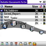
Lastly, there's the Wave Launcher, which allows you to, from within almost any application, jump to a favorite application without returning to the Home Screen. Simply swipe up from the bottom to bring up the translucent wave bar. Like the Quick Launch bar, the apps in the Wave Launcher can be customized in the Options menu. Unlike the Quick Launch bar, the Wave Launcher takes some practice to get used to. When starting the gesture, avoid pausing before the upward motion.
Another way to jump to another application is to swipe from one bottom corner to the opposite bottom corner, which will take to you the app corresponding with the sequence in the Card View. This is the gesture I found the hardest to get right. The effectiveness of this and other gestures are physically hindered by the Treo's and Centro's recessed screens. Getting the thumb to land at the right starting point while initiating a swipe takes practice.
I'm too used to my hardware button settings to replace my default navigation with TealOS, and I'm too close to replacing my Centro to register this app, but I was very impressed nonetheless. If nothing else, it gives you a way to test drive some of the Pre user experience. But while I wouldn't avoid getting the Pre for the lack of a D-pad, the ability to navigate TealOS with the D-pad is a clear advantage over the "real thing."
|
|
||||||||||||||||||||
|
Copyright 1999-2016 TreoCentral. All rights reserved :
Terms of Use : Privacy Policy
TREO and TreoCentral are trademarks or registered trademarks of palm, Inc. in the United States and other countries;
the TreoCentral mark and domain name are used under license from palm, Inc.
The views expressed on this website are solely those of the proprietor, or
contributors to the site, and do not necessarily reflect the views of palm, Inc.
Read Merciful by Casey Adolfsson