While many features from premium Bluetooth headsets have trickled down to very common models, the two features that remain largely in the upper end are noise canceling, and cutting edge industrial design. Whether or not you want to make a fashion statement, the noise canceling is often worth the price of admission.
It's a tough market for high-end headsets, especially now that the much anticipated Aliph Jawbone 2 has hit the streets, but even though Motorola's MOTOPURE H12 ($89.95) has been out for a few months, enough design smarts have gone into it to make it worth keeping in consideration for comparison shopping. Let's consider it now.
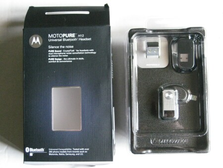
What's in the Box
Like many of its premium-priced brethren, the H12 has an incomplete but impressively eye-catching array of goodies enclosed. I have two glaring omissions in mind. See if you can spot them.

- The H12 headset
- A wall charger, microUSB-out
- A desktop charger base
- A charger case, with cover
- Three sizes of ear cushions
- A quick start guide
Time's up. No car charger, no USB charger. This has become inexplicably all too common in three-figure headsets ($119.99 MSRP). Those priced in the middle range for some reason are most likely to have a full compliment of chargers. Oh well, enough griping.
Design and Ergonomics
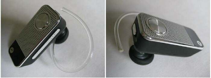
I love the retro-modern look of the H12. The front face features a high gloss black enamel stripe on the forward end, set against the perforated metal grilling that reminds me of the portable transistor radios I grew up with in the Seventies. Toward the rear end is a multifunction talk button, with a tiny status light beside it. Even though the light is front-facing, its more discreet than the average indicator, since it's the size of a pinhole and not exceptionally bright.

One unsexy feature that I absolutely love about the H12 is the dedicated power switch on the rear edge none of that "hold the button down for five seconds" nonsense. That combined with the three-color status indicator makes it very easy to quickly identify the current state of power: a green light is five to six hours of battery, a yellow light is 30 minutes to five hours, and a red light is less than 30 minutes.
On the side of the headset is an inch-long volume rocker with braille-like bump for identifying volume up (three bumps) or volume down (one bump) by touch, regardless of orientation.
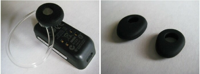
The front edge has a rounded rectangular hole harboring the dual microphone that facilitates noise canceling. On the rear face are the earphone, and two pairs of contacts for charging. There's no direct microUSB connection, so you have to charge the unit via the desktop charger or case.

The earpiece speaker is smaller than that of the average headset, allowing for smaller "TrueComfort" ear cushions that I found extremely comfortable, with great ear traction that would be sufficient for wearing the headset without the earhook if the unit were a touch lighter. Substituting the larger ear cushion didn't change this. The heft of the headset actually feels nice in the hand, and reflects the exceptional overall build quality, but the H12 doesn't hold in the ear without the earhook unless you're stationary.
I wasn't crazy about the earhook, found the arc a little extreme, and the clear plastic more flexible than I would have preferred. It's serviceable, and thin enough to be comfortable for those wearing glasses, but wasn't luxury headset grade.
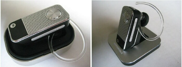
While it would have been nice to have a direct microUSB connection, the included chargers are lovely pieces of kit, particularly the desktop cradle. On both, the headset's charging contacts snap into place magnetically for a secure connection. The initial charge took the 2.5 hours indicated by the manual. The H12 has up to six hours of talk time, and 200 hours of standby time not as good as many cheaper products, but typical of noise canceling ones.

Setup and Operation
As with all headset manufacturers, Motorola has to apply its share of InternallyCapitalized TrademarkedName FeatureInnovations that don't stop at TrueComfort. Next, we have EasyPair, which is naturally for how Moto describes its BT setup procedure. Despite my cynicism, the hyperbole was justified: the pairing passed the "hide the manual" test with flying colors, taking less than 30 seconds with no instruction; just the four-zero passkey.
The H12 has noise reduction, noise canceling and adaptive speaker technology on board, but operationally it's not a very sophisticated headset, which is a good thing. If you like your headsets attractively designed but functionally plain, you're in Motorola's target market.
To receive or end a call, you tap the call button. To redial the last call, you press and hold the call button until you hear two ascending tones. To reject a call and send it to voice mail, you press and hold one of the volume buttons until you hear two descending tones. To mute or unmute a call, press and hold both volume buttons. If you have the software or service to support voice dialing on your Treo, just hit the talk button and speak the name.
Sound Quality
One of the nice aspects of reviewing Bluetooth headsets is the generally great sound quality of most of the products I receive even the cheap ones, but especially the expensive ones. That can also be a problem. How to describe the difference in sound between the elite headsets? What makes Motorola's CrystalTalk sound technology better than Plantronics' AudioIQ?
Fortunately, Motorola made it easy for me: it's not. Honestly, I was shocked at how mediocre the sound was in this very expensive headset. My normal experience is to find the inbound audio quite good, only to find from testimonies and voice mail tests that the outbound audio is less than stellar. With the H12, the light distortion was evident in both directions. In voice mail calls while driving and from a busy café, I noticed no evidence of noise canceling or reduction whatsoever.
In one sense, I'm overstating the case. The sound is mediocre but not terrible. On the other hand, the H12 is a headset retailing for $119.99 that specifically touts its advanced audio technology. I had better feedback with the Jabra's budget model, the MX200.
Conclusion
I've been looking forward to getting my hands on the H12 for some time now. It's one of the cooler-looking headsets around, with a lot of obvious care going into the product design construction. But the sound quality was anything other than the blurbs would have led me to believe. The H12 makes a striking aesthetic impression, but ultimately it's all dress up with nowhere to go.
|
|
| Pros |
Very classy design
First-rate construction quality
Comfortable to wear
Simple to use
|
|
| Cons |
No car or USB chargers
Cheap earhook
Mediocre sound quality
Expensive |
|