Using Windows Mobile 5

When I first started using the Treo 750v, the experience was so foreign that it was easy get frustrated. Ive owned the original Pilot 1000, the Handspring Prism with VisorPhone, and most recently the Treo 650. This is a completely different device because it runs on wholly different software.
Despite being called Windows Mobile 5.2, this OS doesnt feel much like Windows on the desktop. Sure, it has a start menu and a task manager. However, you only see one Window at a time and programs do not quit when you click on the x. Instead, they continue to run in the background. This behavior is more akin to OS X than any flavor of Windows that I know. Windows Mobile promises to shut down programs in the background as necessary in order to free up space. At first I found that to be a pretty radical idea, yet in practice it seems to work as I never ran out of memory and only occasionally experienced a slowdown. I did intermittently pull up the task manager anyway - to see what was open and to shut down programs - but that was more out of fear and habit than out of necessity.
As far as appearance goes, Windows Mobile allows for only a little customization to the GUI out of the box. Oddly, I didnt notice the fact that there was less resolution on the 750v than on the 650. Maybe its because I didnt have them side by side. However I suspect it is because the graphical interface on Windows Mobile is simply better.
The Bad News: Wasted Space

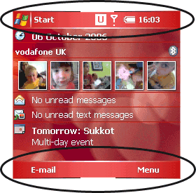
That said, I do have one huge gripe tangentially related to the resolution. Screen real estate is one of the keys to effective smart phone use. One of the major problems with Windows Mobile is that a large percentage of the screen is wasted with not just one, but two information bars. The top bar I like, it contains useful information such as the time, connectivity, battery life, network connection, and the Start Menu.
What I dislike is the bottom bar, it's a waste of valuable pixels. On the right we nearly always see "menu." In my opinion "menu" simply should have been permanently set to the button below it. To the left is the context-sensitive button. In Contacts it says "new," In Calendar it allows you to change views, and in Outlook Mobile it again changes to "new." In between this brilliant waste is an icon to bring up a virtual keyboard. On the Treo, a virtual keyboard is, how shall we say, a bit redundant. Occasionally it's helpful for the odd character that's not on the keyboard and you can't remember the special key combination. The only built-in application that allows you to go full-screen is Pocket Internet Explorer. If other applications were full-screen capable I wouldnt have a problem with the menu bar.
Its odd because Windows XP allows for the auto hiding of Taskbars and also supports Full Screen versions of applications.
One thing everybody gripes about with WM5 is that it requires extra button-presses and/or the stylus to perform common tasks. I've been using the device a lot for e-mail and although I do have to pull up an extra menu to send/receive, I can simply press the S shortcut key or continue to use the 5 way. I've only occasionally noticed a spot where I had to pull out the stylus. I am a habitual stylus user as I have always found it the most efficient way to move around the screen, so it's been a challenge to force myself to use solely the five-way to see what the complaints are about. Occasionally, in applications like the Task manager, the five way support breaks down. I can end one task, but trying to end another just using the five way is impossible. I think five way support is actually well implemented. Perhaps WM 5.2 has made some improvements over WM5.0, but occasionally you find yourself in a spot such as this where the five way no longer functions as it should.
The Great News: Today

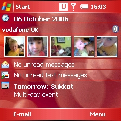
The more I use the 750v, the more I understand what a great leap forward WM5 is. The Today screen pulls all of the pieces of the OS together. This one simple screen gives you direct access to your contacts, e-mail, calendar events, speed dials, and more. The key to using WM5 effectively is to understand the Today screen.
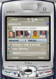
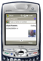
Pressing the Green Phone button takes you directly to the Today screen. There you can type in a phone number or the name of a contact in the format J Doe. A list will pop up with which you can dial their primary number, chose a different number for that contact, e-mail the contact, text message the contact, or edit the contact.
It was this type of functionality that was the hallmark of the original Pilot 1000: Instant-on access to important functions. To get the most from a Windows Treo, youll want to customize the Today screen. The most efficient use of this space for me was to create exactly five speed dial pictures, one of which is keyed to my voicemail. This allowed me to get rid of the annoying Voicemail Bar. I just assigned a cute picture to the voicemail option and was all set. With the speed dial buttons, if you press/tap and hold for the context menu, the other options linked to that contact other numbers or messaging are available.
Also, when customizing the Today screen, I recommend that you hide the big contacts look-up field. This field will simply pop up automatically when you start typing in the Today screen. A click on an appointment takes you right to the Calendar. Some might want the Google search box though I try to keep the number of items on the Today screen to the necessities so I wont have to scroll. Youll probably also want your upcoming appointments and notification of e-mail and MMS messages. The right menu on the today screen allows you to customize preferences. If your eyesight is good, Dieter suggests ratcheting down the font size a notch to get even more out of the screen. The fonts themselves hold up remarkably well, though the 'clear type' option is anything but clear.
Other Customizations
Although you can remap the Phone, Windows Start, and OK buttons, this turns out to be pretty impractical. I found this disappointing compared to the PalmOS Treos. For those bemoaning the multiple clicks, option + a button as well as holding the side button provide shortcuts to applications. On the other hand, with the PalmOS Treos you press the Option Button, then press the application button afterwards. With the 750v you must hold down the option button. It pretty much is impossible to do one-handed and this annoys me.
Phone Functionality
The Treo 650 was plagued with all sorts of volume and sound quality issues. Not so the Treo 750v. I wouldn't rate it as the best handset I've ever used, yet I never had cause to complain. One thing is certain -- it is loud. Even on the lowest setting, the volume is very present. In fact, I would prefer that the default value was lower. Here in Europe, text messaging is the standard communication. So with the few people I met, we tended to text a lot. When I do use the phone, talk time seems good and the battery, despite being smaller, seems to hold a solid charge throughout the day.

It would be nice to believe that the lack of the external antenna didn't affect reception. Sadly, it does. So those of you with your 700 machines need not kick yourself for not having the latest and greatest just because of the antenna. Though my studies have been unscientific at best, when comparing other phones in the same spot on the same network the phones with an external antenna did far better than those without. Weaving in and out of buildings in a car, I lost signal when I had a feeling that with a more robust antenna I might not have.
On the other hand, much more important than the antenna is the choice of carrier. Certain carriers have better coverage and strength in different areas. It's odd that perhaps the most important thing, phone reception, is often the least researched by a consumer. T-Mobile has much better and consistent coverage where we are in the outskirts of Cambridge than Vodafone. This means that even indoors there is better reception. I highly recommend that before purchasing a 750v you check real world reception and coverage of your potential carrier (i.e. Vodafone. At least for now).
I'll talk a little more about Vodafone later in this review.
Next Page: More Features
>>