Welcome class! And you, yes you in the back row, take that gum out of your mouth.. and DON'T stick it under your desk..
As you know, icons, the foundation of any graphical user interface or "GUI", are the little graphics with which you interact with your data in a visual way. Whether on your Treo, your desktop or laptop computer or anywhere else that they're found, Im sure (at least I hope) youll agree that the graphic icon is the measure of how easy it is to recognize anything on your device, whatever it is.
Thankfully, not all icons look alike. Imagine how confusing it would be if the design of PalmOS' Calc, Memos and Web icons on your Treo all looked alike, or even similar. The pure chaos of such visual monotony would be devastating.
Thankfully, these miniature visual cues are as different from one another as bread and Swiss cheese, and they come in a variety of shapes, sizes and colors so that you may quickly identify one application from another with a quick glance. Sure, Launcher icons have their associated program or file's name under them, but sometimes you have to scratch your head and wonder why a software designer made his program's icon look the way it does. The creation of icons is truly an art unto itself.
Many programs also use icons within their interfaces, to assist you or to differentiate different tasks. Some programs have so many icon-driven functions, there's simply not enough screen real estate to put a text label under them; in those cases, good icon design is paramount.
The software designer must design his on-screen buttons to logically represent their function, and this isn't as easy as it sounds.
iambic's Agendus, for example, uses MANY icons in most of its views to identify meetings, tasks and calls visually, rather then by textual descriptions alone. While this greatly speeds up the process of using the program, the included icons are limited, and even the add-on icon packs that iambic sells dont cover every need.
You may say the same (for that matter) of your PalmOS' apps launcher icons, or the icons on your desktop PC. No, nothing is ever perfect, and sometimes you just need or want to flex your own creativity and make some designs of your own. This, however, is easier said than done. Designing good icons for any purpose requires a different set of skills than making a good website or magazine cover. In fact, most people commonly think that you need to be a very detailed, skilled artist to make an icon, but the truth is quite different: to make a high quality icon, youll actually need to use a great amount of optical illusion.
Amiga: The Friendly Computer with a Friendly GUI
In the computing heyday of the 80s and early 90s, no system came as close to offering as fully a customizable GUI than the Amiga Workbench. Back in 1985, when the Commodore unleashed the revolutionary Amiga 1000, most people were used to using complex strings of commands in a text-based command line interface (CLI), which meant that to use any machine youd need to learn both the proper syntax for its operating system, and the appropriate commands that it uses. Think original IBM-PC and green screens and a DOS ">" prompt staring back at you. Not visually intuitive. Not intuitive at all.
While the Apple Lisa the forerunner of the Macintosh, formally introduced the world to the personal computer GUI and its icon-based world, the Amiga offered its owners something that no-one else at the time even conceived possible: a full-color desktop. Of course, along with this dazzling and vibrant OS came a set of equally impressive (for the time) icons, each of which could be easily customized and of any size you fancied.
Amiga developers were supposed to conform to Commodore's official "Style Guide" for interface design.. most did, but many went wild. Amiga's built-in program called Iconedit even shipped with the operating system so that you, the user, could edit the icons in place, or design your own from scratch. The beauty of the Amiga, was that a program or file's icon was a totally separate file on disk from the program or file itself. If you didn't like an icon's look, you could simply change it to literally anything you could dream up with Iconedit.
In contrast, Mac owners had to resort to using third-party resource editors, such as the (in)famous and revered ResEdit, an application that still sees heavy use today, to get the job done.
Nowadays, most software companies think that you should stick to what they give you. That's kind of like the computer equivalent of what it would be like if, when you trotted into McDonalds, you had a choice of a hamburger with fries, or fries with a hamburger. What if you went to Subway and told the clerk Ill have one sub please. with no way of defining or refining exactly what kind of sub you want, or what you prefer them to put on it.
The same concept goes for icons: why be stuck with someone elses idea of a good design, which may or may not catch your eye, or even make sense, when you require it to do so?
Thankfully, the world is full of choices that afford you the flexibility to customize and thus there are still ways around this, and though editing icons isnt the breeze that it was in the old days, there are still applications that are able to do it. Agendus has this ability built in, though if you want to tinker with your Launcher icons, youll need a helper app first.
Essential Tools of the Trade
Before you delve into changing the look and feel of your Treo's apps launcher, or any other program for that matter, youre going to need to strap up and get your tools together, if you want to make your own PalmOS icons, or edit existing ones in place. If you want to get down and dirty with your Launcher icons, here are some crucial apps with which to do so:
IcoEdit, a shareware utility from MapleSoft allows you to create or edit Palm Launcher icons, but is limited to low-res black and white icons, circa the Palm Pilot / Visor monochromatic days. If you only need to slap together an icon for an older app or add a little more pizzazz to one that you have this may do the trick. Just dont expect many bells and whistles.
If you want to get fancier and more artistic, and have some time to get over its steep learning curve, ACCESS offers you the Constructor Software Development Kit ("SDK") for PalmOS.
While Constructor lets you make the slick, high-resolution, full color modern-looking icons that you're familiar with, it only runs on Windows and requires you to do the work there, before you install the PRC on your Treo. Of course, you can always copy the PRC file to a card and then back again after you edit it, but any way you look at it, its an extra step.
Icons Plus from ESTVO is a commercial Icons Package utility. While it doesnt allow you to directly modify your existing icons, it does let you set, via a preference pane, replacement icons for all your applications and data. You can always create your own custom icons packages too, and it works with multiple launcher replacements, in case you are using one. If you're looking for a quick and easy way to refine your already-existing icons, this is your ticket to achieving your goal.
Of course, if you are an Agendus user you can use the Agendus Icon Editor to modify or extend your existing icon library. Thankfully, this feature is built-in, so you wont have to scrounge around for a third party application in this case.
In the Making
Creating your own custom icons means using a bitmap editor, or pixel editor to generate (from a greatly magnified perspective) the final product, which is usually one tenth the size of your canvas. Why the big difference? Try to edit something the size of your pinky nail in 1:1 real size and youll quickly learn the answer that's like trying to carve Scrimshaw or repair a watch without a magnifying glass or a jeweler's loupe. Good luck.
But before you jump in and rush head first into cranking out icons that look like yesterdays slop, youd best get used to the way this kind of program works.
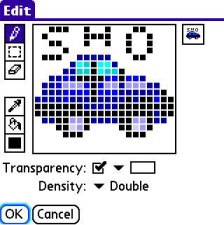
Most bitmap editors sport a variety of design tools, like leeeetle tiny computer paint programs, and have two displays: the enlarged editing window, and the true view of your icon as it will look (final product) in whatever app to which it belongs. The most useful tool is the pencil, which alters the graphic one pixel at a time.
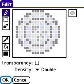
Most editors also have a grab mode, with which you reposition (re-center) the graphic, and some have tools that create boxes, circles or flood-fill. Of these, the latter three will rarely be of any service, though the circle tool, if present, may be useful for beginners. Unfortunately, it has mixed results and tends to be rather hit-or miss when making believable representations of a circle in such a limited canvas. For this, youre going to need to learn how to make a circle with the pencil tool.
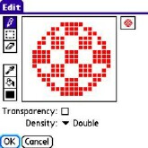
If you spent any time in a College or even High School art class as I did, you'll know that circles are the second hardest shape to pull off properly, as they require a great deal of staging, or using series of lines and blocks, to create the illusion of being round. The coin example above, and the Boing Ball (the original Amiga logo) left, depict what a properly staged circle should look like.
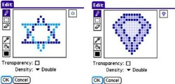
Creating other shapes (anything non-rectangular) often requires staging as well. Obtuse triangles (those with one angle measuring more than 90 degrees) are among the hardest to execute, as the square pixel canvas doesnt lend well to non-uniform shapes. Thus, making one that has the right angles and yet also covers most or all of the canvas can be tricky. These are good examples of staging for non-uniform shapes.
Next Page: Never Fret on the Details >>