
It is amazing how much more we demand from mobile technology when compared to just a few years ago. A few years back, I was flabbergasted by the extreme portability and versatility of the Motorola's insanely popular Star-Tac line. It seemed like THAT was the cell phone to own. Before my first Treo, I purchased one of their shiny silver TimePort editions, moving up in the world from one of their kludgey brick models, into the new world of digital phones.
Looking back, the Treo seems a huge leap from that tiny Silver phone with a miniscule four-line monochrome display and a thin, pull-out antenna that broke on a monthly basis, and yet, every year phones got smarter and more sophisticated.
We as a society constantly demand more from our pocket pals: more functions, more glamour and more power. Yet, too often this comes at a price: the lack of streamlined user interfaces.
Even if what you have suits your needs, personal electronics mfrs. love to bombard us with advertising, making us feel inadequate if we don't have the latest model of everything.
While perfectly functional, there ARE some lackluster aspects of your Treos built-in phone and data applications. Gx5 believes that their new product, UltimatePhone ("UP") solves some of these problems, and delivers more satisfaction than the typical Cracker Jacks ("out of the box") apps, by gluing on a new interface that both ties all of your messaging utilities together and gives you easy to recognize icons and photos for managing or dialing your plethora of contacts.
The Skin Aspect
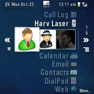
In reality, there is no such thing as a perfect user interface. Your Treo may come with PIM applications that cover all the basic needs of your day-to-day communications, but someone out there is always trying to re-invent the wheel, and while UP does glitz up the usual work space, it does so by sacrificing several key concepts, including how much information you can see at any one time on your Treos miniscule 2 inch screen.
UP's GUI is lick-ably gorgeous: smooth and fluid, and transitioning through its various aspects is fast and easy with the 5-way pad, which means that you can keep your stylus parked for a while. In fact, the added usage of the backspace key to move to a previous view makes the user interface completely stylus-free.
The flip side is that, if you actually want to use your stylus, UP's interface is handicapped in such a way as to be counter-productive.
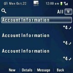
There are no scroll bars anywhere in the program, so paging through a list of contacts to find someone whos name escapes you is best left to the default Contacts app (or Agendus), which displays far more than the piddling three entries at a time that UP offers you in its contacts view. Luckily, UP does let you enter the first few letters of a name to dynamically jump directly to it, or to the next nearest match.
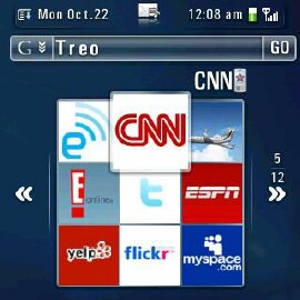
One feature that UP offers that is superbly useful is the fast posturing of Web and Google searches. Flipping through News, Wikipedia or Dictionary articles is a snap, and you can easily reconnoiter or expand the Web 2.0 app selection through the programs intensely vast preference panes.
In fact, the amount of customizing options in UP is so astonishing, you may get lost or confused as to what each function does, or what you had originally intended to modify. You can always set a different Web protocol as your main love for the search bar, but unless you are constantly perusing Wiki entries or Flickr pages like a madman, the default works just dandy. This is a program that, once installed, you're gonna have to sit and fiddle with for a while, until you have it set up the way you like it.
Photo Dialing
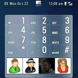
Personally, I have never been in love with the concept of photo dialing, as I dont find it any speedier than popping open my contacts list to select a victim. But that said, I know some of you love photo dialing, and many people are enamored with the idea of poking their friends face repeatedly with their stylus or finger, or just find it easier to remember who everybody is in their life by face rather than memorizing names or numbers.
Certainly, that visual paradigm is more expedient than trying to figure out one name out of a list of hundreds of people stored in your Treo. Be it the cute girl for whom you bought a drink last Friday, or the new meeting coordinator that just re-arranged all of your staff scheduling for the next five months. One way or another, sometimes it is easier to remember a persons face than their name, and this is where photo dialing shines.. assuming you HAVE a photo of that person (or logo of that company) on your Treo.
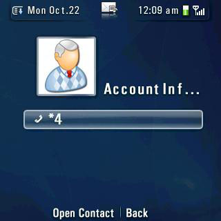
Making "tiles" from which to use photo dialing is a breeze as well. Just tap on one of the empty white boxes and select a contact, then simply choose a photo from your albums, an icon from the built-in icons or snap one with your Treos camera.
Speaking of icons, the included set is also expandable via an on-line updater. You can download multiple sets of icons over your wireless data connection, although Ive encountered some stability issues while doing so. The first attempt caused my 700p to crash, the second pretended to work, but did not actually add any icons, and the third crashed again. Instability city.
The program does have a Check for Updates feature though, (something I think EVERY data-connection-aware PalmOS program should have..) which is hidden in the Version prefs pane, so youll be able to download the latest rev, whenever it is available.
Once you spruce up your contacts with appealing imagery, you then merely tap on one of them to initiate dialing. If you make an oops, you can either press the hang-up button or tap the on-screen cancel button. Unfortunately, the cancel button is so tiny it forces you to whip out your stylus in order to utilize it. Did the programmer have long fingernails?
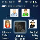
If the default three tiles mode doesnt tickle your fancy, UP has a glut of viewing modes from which you may choose. Select from a multitude of three-tile views, or a nine-tile mode which gives the most choices, or the ever-constantly advertised My Faves style view with five tiles in a circle which displays your top five most commonly dialed contacts.
You may also sort contacts into categories, which you can then opt to use to sort the tiles into groups. The problem is that if your contacts are already categorized youll have to redefine them all for UP, as it does not use the Treo's built-in contacts managers category settings at all.

Additionally, if youre getting bored with the old-fashioned SMS messaging app, UP does have its own SMS skin which you can select to use as your default messaging client in its preferences section. The UP's version has a slick cosmetic appearance, but sadly, it does not let you highlight text for a cut / copy / paste operation, (as when you want to send the same SMS message you just sent to someone else, without having to type it in all over again copying and pasting SMS texts is something I do all the time).. so it doesnt hold up quite so well in the features department.
The other downside is that UP does not give you the choice of SMSing a contact when you tap it, which is a severe short-sight on behalf of the developers. Instead, you must tap either the messaging button if you have it configured to be the SMS key, but not if you set it to open your default email client, or press both the option and m keys to send a message. Certainly, the ability to send a quick message with a tap-and-hold would have been easy to integrate, and more logical to use, but alas, it is not possible in this version of UP.
If youre a voice dialing maniac, UP also ties into VoiceDialIt, so if you are already a user of that program, you can enable voice dialing from within UP and use it normally.
Settings A-Go-Go
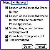
UP has more preference settings than a dog has fleas, so lets explore some of them in detail. The first thing that you need to decide is whether to assign UP to your phone button. That is, if when you press the phone button on your Treo do you want UP to materialize instead of the normal dial pad. If you like the way UP functions with its jazzy interface, the answer will most definitely be a bold Yes.
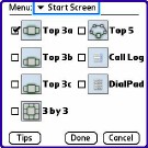
If not, you can always press both the phone and home buttons to bring it up and in the same prefs pane you can opt to auto-dial a contact when you tap on their face, or display a dialing screen which gives you the option to back out of the potential conversation or initialize it upon your discretion. Of course, this may also be a good idea if you sling your Treo naked in your pocket to avoid any unintentional calls.
You can also modify the shortcut for option c to have it open the contacts list, call log, or categories list. Call log is, for some obscure reason, the default, although anything that requires multiple key presses is far from expedient to use. Leisurely messing around with a new program when you're learning it is one thing. NEEDING to use it quickly out in the real world is another.
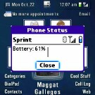
UP also lets you display upcoming calendar meetings and events on its main screen, and permits you to compose an email with just one tap. Further, your Treos battery status and other valuable information are ever-present in the upper-right quadrant of the screen, albeit in a microscopic form. Thankfully, one tap on the gauges DOES expand them to an easily examinable view.
Other options, such as enabling the green wing button to make a call instead of the phone button are 700p (or 680) specific.
Next Page: Faults, Flaws and Conclusion >>