For many of us, a shopping list is something scribbled on a notepad or Post-it thats crammed into a pocket and pulled out when visiting a store. Upon returning home, and sometimes the minute youve walked out of the store, that list gets crumpled and tossed away. Yeah, the idea of "reduce, reuse and recycle" doesn't come into play with this approach.

Along came Apple's App store, and with it a reminder that there are all kinds of ways you can accomplish things quickly and efficiently from your smartphone. Those of us carrying a Centro or Treo may suffer from iPhone envy due to the sheer volume of affordable apps that are available for that platform. Rather than waste energy on wistful ponderments, we ought to focus on some of the many apps that have been developed for the Palm OS platform over the years (remember... Palm came first!).
So with that in mind, and after having such an awesome experience with SplashData's SplashPhoto app, I thought I'd give SplashShopper (SRP $29.95) a try.
It is described as an app that "offers a powerful and easy way to manage everything from grocery shopping to holiday gift lists to keeping track of DVD rentals." First introduced seven years ago, in February 2002, this app lets you manage multiple shopping lists on a Palm OS handheld and desktop computer.
Oh yeah... for your $29.95 investment, you basically get two apps that should play nicely with each other. And since the desktop version ran on Mac OS (Version 10.2 or later) and Windows computers, I figured this was something worth checking out. I was really curious to see if SplashShopper was worth every penny and a good use of my time.
Getting Started
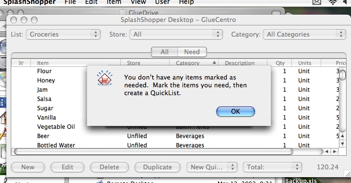
After downloading SplashPhoto to my Centro and my PowerBook, I decided to launch the desktop app first. To me it seemed like typing up lists on my Centro would be kind of tedious, so I opted to use my normal keyboard to create a list on my PowerBook that could be synced up to my Centro.
What SplashData has done is provide you with a number of shopping lists that you just need to modify. This is actually a great idea because you aren't fumbling around trying to figure out what to type into the various fields.
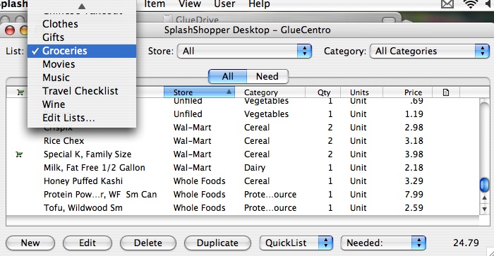
The sample lists include Groceries, Gifts, Books, Clothes, Movies, Music, Travel Checklist and Wine. There is also an option to Edit (Reuse) lists and create your own. I figured I would jump right into Groceries, though for the most part I tend to buy the same things every week and only use a list if something out of the ordinary is needed (i.e. canola oil or brown sugar).
When the QuickList comes up for the first time, you are presented with pretty much everything you can find in your local Safeway or A&P. There are 11 columns of data that can be displayed with 9 being customizable. Reading from left to right: The first column is where you toggle, with a shopping cart icon, if you need an item. The next column is the Item name (i.e. Bottled Water), followed by Store, Category, Description, Aisle, Quantity, Units, Price, Coupon and Note. Youll notice in the picture that beyond Price required scrolling.
Wow! That's pretty darn thorough!
But for me, a lot of that information is not needed and just screen clutter, so I decided to put my list on a diet.
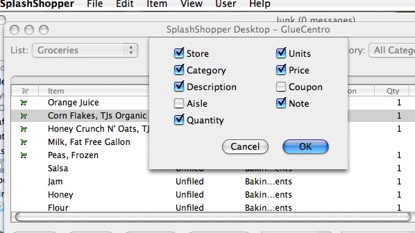
I kept Store (i.e. Trader Joe's, Safeway, etc.), Category (i.e. Dairy, Cereal), Quantity, Unit (Bag, Bottle, Can, etc.) and Price. I have certain items I buy at certain stores - like frozen peas at Trader Joe's, and my Aussie yogurt at Whole Foods. So I really like this idea of having one list that can be filtered/sorted per store.
For some reason, they make it easy to sort on Category. My guess is that this is related to the Aisle option that I'm not using. If you sort by Category, then you can have all your Dairy items show up together.
On the lower part of the screen, you have buttons related to Items on the list: New, Edit, Delete, and Duplicate. New lets you add an Item starting from a blank slate.
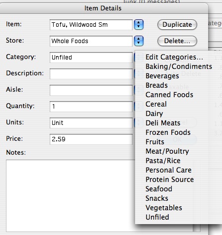
So I decided to add something that wasn't on the default list: Wildwood Tofu. Since it came in two sizes, I entered it as: Tofu, Wildwood Sm. I can only get it at Whole Foods, so I added that store to my list of options. As for Category, I'll admit I was scratching my head. Where the heck to you put Tofu? I find it in the store near the Dairy section where all the meat alternatives are parked. But I have a hard time thinking of Tofu that way. In my mind it is a source of protein, so I added a Category and called it Protein Source. Ah... Life is good now!
Since I normally only buy one package at a time, I stuck with the default (1). I didn't really care about Units, so I skipped to Price. Fortunately for me, I kept my receipts from my last few trips to Whole Foods, which made it easy for me to plug in price. Click on Ok and my Tofu is now a member of the list.
To create an entry for the larger package of tofu, all I need to do was hit the Duplicate button and then edit the Item name and details.
Trimming the List. There was so much on that QuickList that I didn't need that I found myself grateful for this desktop version. "Killing" all unwanted items would have been a drag on my Centro.
Warning: For some reason, every time you go to "delete selected item," you get an audio warning along with a pop-up asking you if you are sure. That "boop" sound can become quite annoying when you are clearing the list of many (MANY!) items. I had to mute my computer so I wouldn't go boop crazy.
Adding it up. There's one more thing I'd like to point out on this desktop screen. In the lower right there is a dropdown menu that defaults to Total. Next to it is a price. It was telling me that everything on that list after I trimmed it and added my specialty items, would foot to $177.24. This seemed weird to me. Why would I care about that amount?
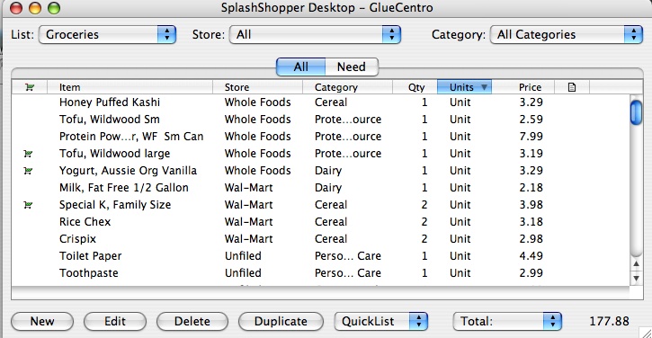
So I went back and toggled just the items I needed (or in my case, the ones I just bought the other day at Trader Joe's). Then I went to the dropdown menu and found there was a Needed option. So I highlighted that.
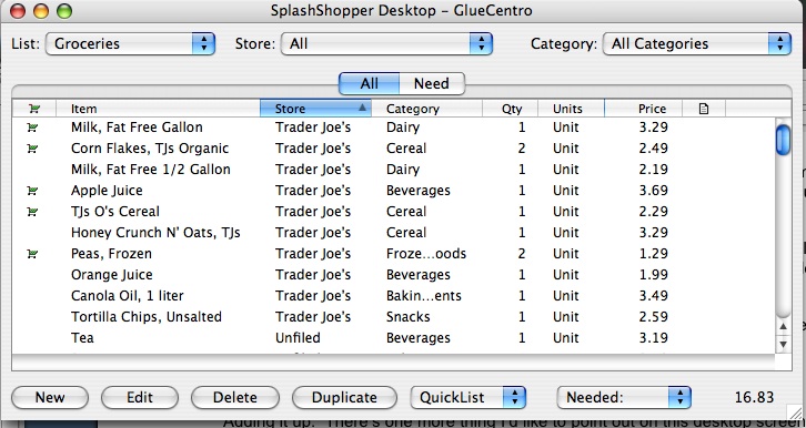
An amount of $16.83 comes up. Now that's much better and matches my receipt (for checks and balances purposes). What it tells me is that if I grab a $20 bill heading out the door for my TJ's run, I'll get change back. Woo-hoo!
List To Go.
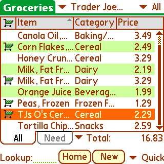
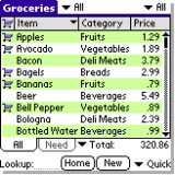
Time to see how well the desktop app talks to my Centro. After performing a HotSync, I loaded SplashShopper. The Home page displays a list of all the Shopping Lists. So I clicked on Groceries and was presented with a neatly displayed listing of All products from the list I created on my desktop. I was especially pleased to see the alternating green and white background for the rows of items which made the list very readable on the Centro's little screen.
Keeping with the Trader Joe's example, I tapped on the dropdown menu and highlighted it so that the screen would only display my TJs items.
In alphabetical fashion, I saw Apple Juice through TJ's O's Cereal on the opening screen (Note: 9 items can be displayed at once). The toggle shopping cart is in the first column. And the total in the lower right matched my desktop ($16.83). For fun, I decided to remove Apple Juice from my cart. The total dynamically changed to $13.14. So far so good.
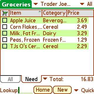
That was in the All tab. There's another tab called Need. That had me curious.
When I tapped on it, only the four items I had toggled appeared (remember that I removed Apple Juice). In this list, there is a little box to the left of the item. So as I add things to my shopping cart, I can check them off the list.

There are two things to pay attention to here. In your List Preferences you have two options at the top that impact what you see when you check items off your list:
- Show Completed in Need View
- Sort Completed Items at Bottom
When unselected, your screen will appear blank. That's right. All the Items have disappeared, which can be a little disconcerting.
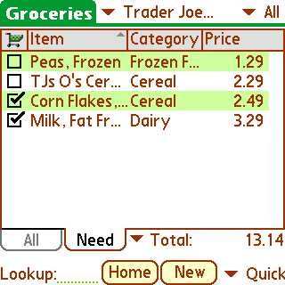
So I went back and selected these to in the Preferences. Once I check off an Item, it is moved to the bottom of the list with a check next to it. Much better!
Other Features of Note.
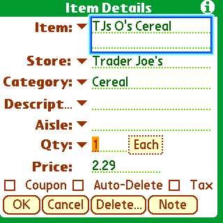
It is easy to make changes on the fly to your list using your Centro. For example, I may notice that the price of TJ's O's Cereal has gone up. Boom... on the spot I can edit that on my list.
Also, SplashShopper really tried to encourage you to share with others (family, friend and co-workers). One option is to use your Centro or Treo's Beam capability. The catch is that the receiving device has to have SplashShopper installed as well.
Back to the desktop application, there is also an import/export feature that uses a virtual shopping list (VSH) format, which can be emailed. This also requires that the recipient have SplashShopper installed. Otherwise, you should opt to export using the standard Comma Separated (CSV) format.
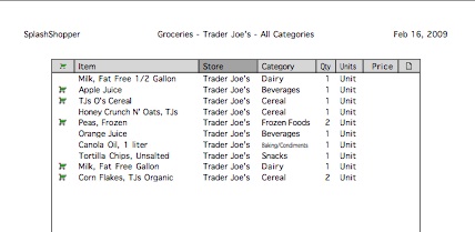
Also, not that you want to kill a tree or anything (remember Reduce, Reuse...), but if you find yourself wanting an old-school paper list, SplashShopper desktop makes it very easy to print one out.
Conclusion A Bit Overkill.
While this is a very thorough program, I found myself thinking it seems so dated. For example, you may wonder why I didn't test drive some of the other list options. Actually, I tried the book one and the wine one, but they seemed very old school. I guess Amazon has spoiled us.
The Grocery List seemed to be the one with the most promise. But at $29.95, I find it hard to recommend. The iPhone version is $9.95. So that pretty much is saying that you are paying $20 for that desktop app. Humm... If there was a family license for that amount, I think I'd jump on it. Otherwise, it seems kind of steep.
The other thing I found troublesome was that it didn't seem finely tuned to work with my Centro's D-Pad. So that meant I had to resort to using finger taps to maneuver. While the iPhone/iPod Touch has made this approach "hip," I found it not so cool because even with my small fingers, it was hard to make sure I was tapping the right box or item. At this price, I want SplashShopper to operate smoothly and efficiently. Instead I found that it slowed me down.
Since the writing is on the wall for Palm OS apps, it is doubtful that SplashData has plans on doing anything to refine this app further. Therefore, I would say punt on this for your Centro unless you really need a formal way of tracking your groceries and knowing how much cash to bring with you when you shop.
|
|
| Pros |
Nice way to formalize your shopping lists.
Helps with budgeting.
Reusable! Flexible and Customizable.
|
|
| Cons |
Old and definitely not optimized for the Centro.
Pricey! |
|